These projects show the Liverpool that might have been. Some were pipe dreams, and some were serious proposals; some of the schemes are 'near misses', and others would have been positive additions to the city
Design for the Waterfront by HC Bradshaw
Source: Charles Reilly & The Liverpool School of Architecture, Liverpool University Press
This speculative 1913 design for the Liverpool waterfront by HC Bradshaw is something of a fantasy and a far cry from today's cityscape. Bradshaw has conveniently 'fogged out' the city behind the main line of buildings adjoining the river which suggest the islands of Venice. The current Pier Head buildings can be seen near the campanile-like skyscraper to the right of the image.
Design for the Waterfront by Stanley Adshead
Source: Charles Reilly & The Liverpool School of Architecture, Liverpool University Press
In 1910, Stanley Adshead submitted this scheme to the Town Planning Review. He depicts a confident city expanding to the north along the river (rather than around a retail core as it has today). The current Pier Head buildings are positively dwarfed by an ambitious line of buildings centered around a large piazza at the end of what looks like Leeds Street.
Liverpool Cathedral by Charles Reilley
Source: Charles Reilly & The Liverpool School of Architecture, Liverpool University Press
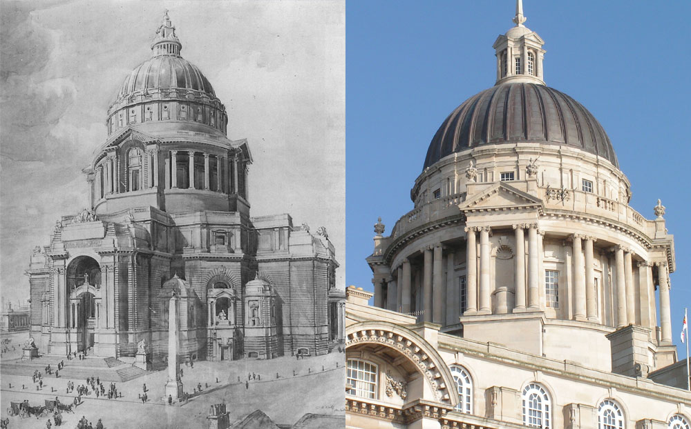
This rendering shows an entry for the competition to design Liverpool Cathedral by the highly influential Charles Reilly. It is not unusual for unbuilt ideas to be re used in other buildings. In this case, Reillys design strongly influenced the dome of the Port of Liverpool building after it was added to the scheme relatively late in the design process.
Lutyens Cathedral
Source: The work of a student at Manchester University, further information unavailable.
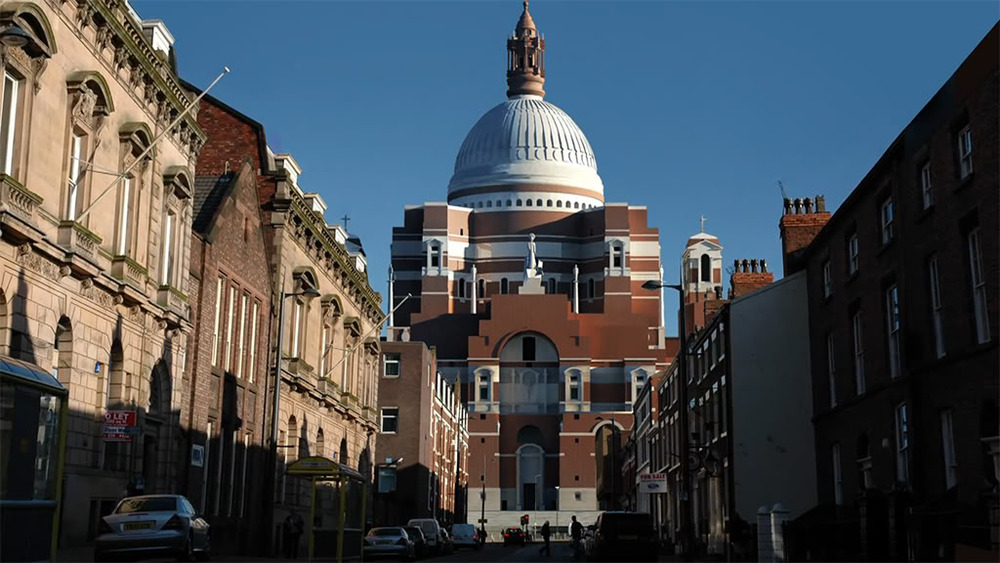
Edwin Lutyens's design for the Metropolitan Cathedral has been described by some as "the greatest building never built". The model of the building can be seen in the Museum of Liverpool and is an impressive object in itself, but these CGI renders illustrate how the completed building would have looked. The awe inspiring, overreaching scale of the cathedral would have dominated Hope Street, the skyline and the city as a whole.
Masterplan Centred on Lutyens Cathedral
Source: Doug Roberts on the Skyscraper City forums.
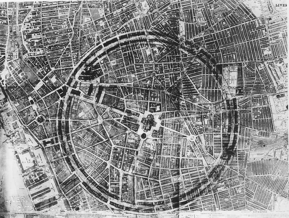
This sketch masterplan of unknown origin proposes that the entire pre-war city be re-centred around the Lutyens Cathedral (as opposed to the waterfront). This may prove to be little more than an architecture student's fantasy, but I have included here simply because it shows such an intriguing 'alternative universe' version of Liverpool. The second image is in the same vein and is from 1943.
Albert Dock Skyscrapers
Source: http://en.wikipedia.org/wiki/Albert_Dock
Drawn up in the 1960s (with unimaginable disregard for the historic fabric of the city), this masterplan erased the Albert and Kings Docks and replaced them with skyscrapers. The developer was Oldham Estates and the scheme was described as a 'mini city' that would provide; hotels, restaurants, bars and underground parking in the drained dock basin.
Chavasse Park
Source: http://www.pjar.com/pdf/Chavasses_Park.pdf
In 2001 Philip Johnson, Studio BAAD and Cecil Balmond designed this mega-structure for Chavasse park. It was to be a two-storey retail arcade linking the city centre to the Albert Dock and was notable for its exceptionally complex roof. The Chavasse Park area, which was formed as a result of bomb damage suffered during the blitz added little to the city until Liverpool ONE was eventually built on the site.
Brunswick Quay Tower
Source: http://www.skyscrapernews.com/news.php?ref=781
The elegant, angular glass Brunswick Quay Tower was designed by Ian Simpson, the architect of Manchester's Beetham Tower. It would have been of roughly the same height as the Manchester tower and was to be positioned far to the south of the Pier Head in the Toxteth section of the docks. It did not obtain planning permission in 2006 after a public enquiry.
Fourth Grace by Will Alsop
Source: http://stevocreative.com/
Looking at this hallucinogenic rendering now, the decision to award Will Alsop the 'Fourth Grace' commission was certainly an adventurous one. I first encountered the practice of referring to the buildings at the Pier Head as 'graces' as a piece of marketing in the late nineties. To my mind, the term the 'three graces' implies there were only ever meant to be three. In my opinion, the buildings at the Pier Head should not be thought of as the only three but rather, the first three of a heroic line of buildings reinforcing the importance of the waterfront. Seen this way, the idea of a fourth 'grace' makes more sense. The idea of a string of spectacular buildings (call them graces if you must) harks back to the Edwardian sketches of the waterfront made at the height of Liverpool's architectural exuberance.


